Seriti
Sector
Film & Production
Scope
- Brand Design
- UI Design
- UX Design
- Design Strategy
- Website Development
Overview
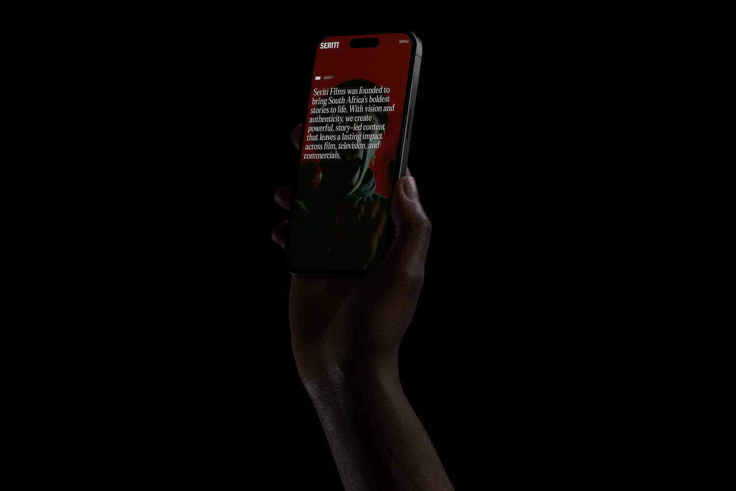
Seriti is a film studio entering a new phase, pitching for premium commercial work alongside the studios that brands and agencies buy from on craft. The work had grown sharper. The brand had not kept pace. It still read as a studio introducing itself, not one already shaping the rooms it walked into.

The Problem
Film studios live a contradiction in their branding. The work is cinematic, expressive, made to hold attention for ninety seconds at a time. The brand has to do something different. It has to function across a website, a pitch deck, a business card, an Instagram grid, and a director's reel. Most studio brands resolve that tension by flattening one side or the other. They go heavily cinematic and lose all utility, or go cleanly functional and lose what made the studio worth hiring in the first place.
Seriti's identity is bold, rebellious, unapologetically original. The previous brand carried none of that. It read as generic where the work was specific, and quiet where the work was loud. Going into a pitch for premium commercial work, the brand was doing none of the lifting it should have been.

The Approach
We took the rebrand end to end: identity, design system, brand guidelines, website, applied collateral, and motion. The unusual part wasn't the breadth. It was treating cinematic expression and functional clarity as one decision, not two.
Most rebrands at this scale split the work. A brand team builds a mood and a wordmark, a digital team designs a website, and the two meet at a hand-off where the cinematic energy of the brand quietly drains out of the interface. We ran them in parallel, with the same people shaping both. The logo, the typography, the way film content sits on the homepage, the layout of a pitch deck: all of it was treated as one surface area answering to one principle.
The Work
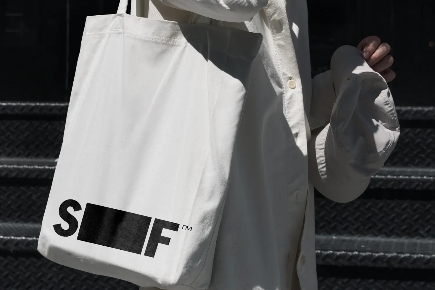
The identity is anchored in the 16:9 frame. It is the unit Seriti's work is made in, and we made it the unit the brand is built from. Perspective, boundary, story, all of it living inside one ratio. That single decision did most of the structural work. Once the frame was fixed, every other element had a place to sit.
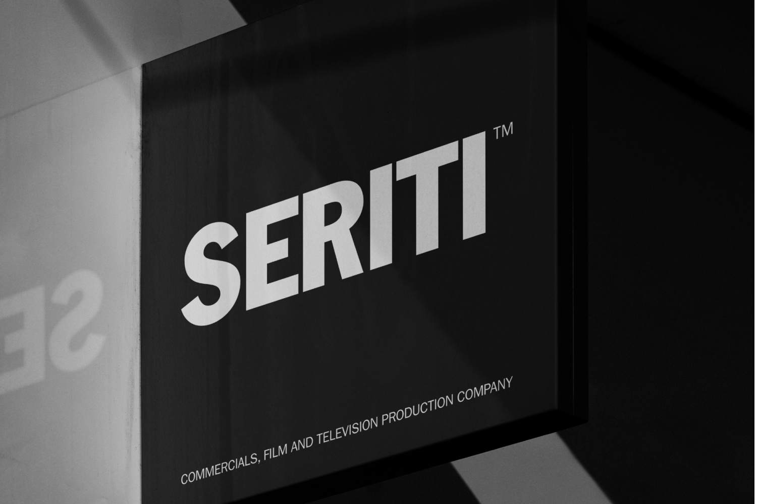
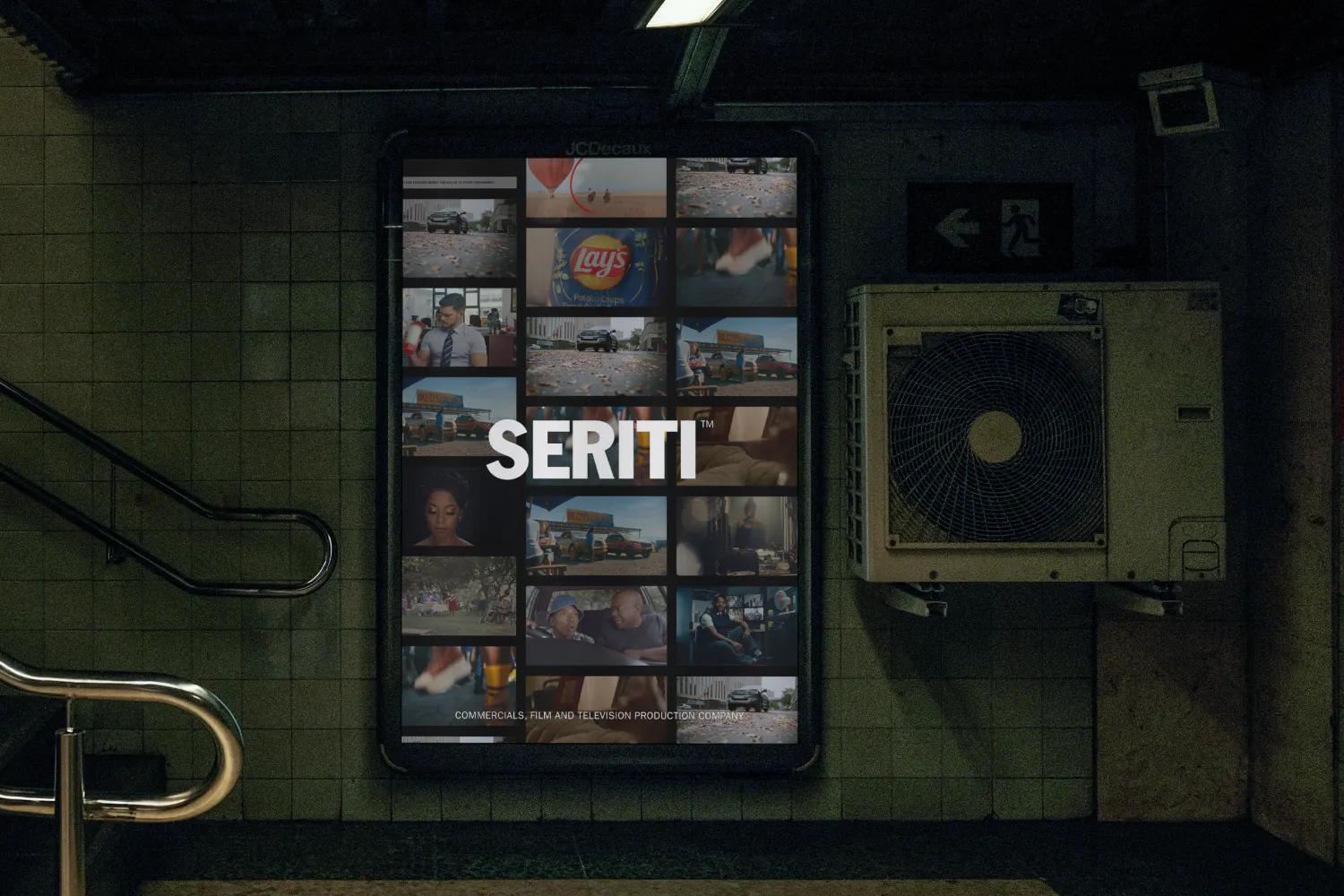
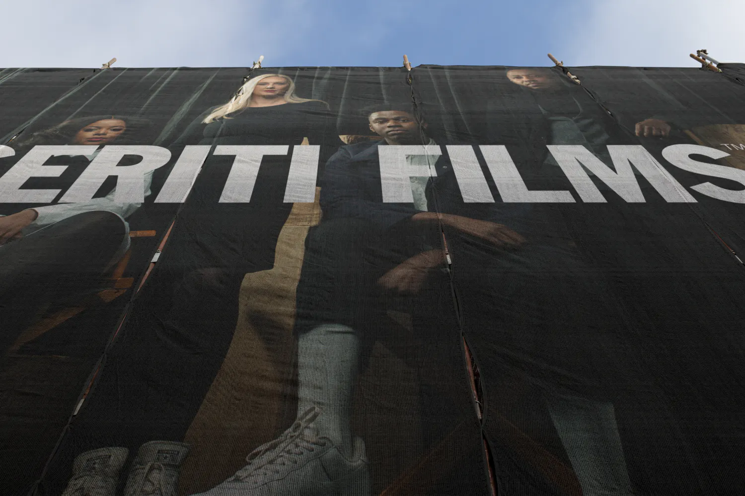
A cinematic colour palette, drawn from the tonal range Seriti shoots in rather than imposed on top of it. Expressive typography that holds its weight at poster scale and at body copy. A logo that reads as a mark, not a wordmark dressed up. Stationery, social templates and motion guidelines all built from the same set of rules, so a single asset could move from a pitch deck to a billboard to a feed without losing its centre.
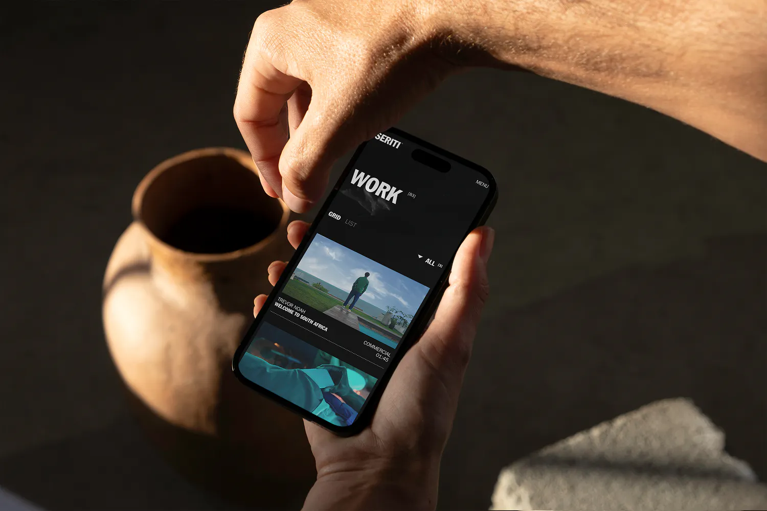
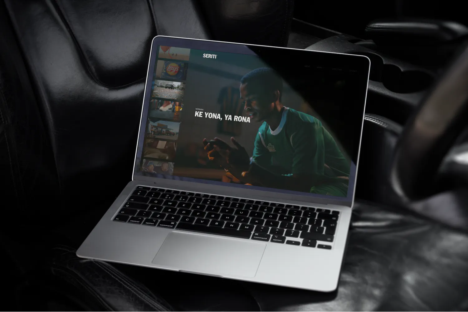
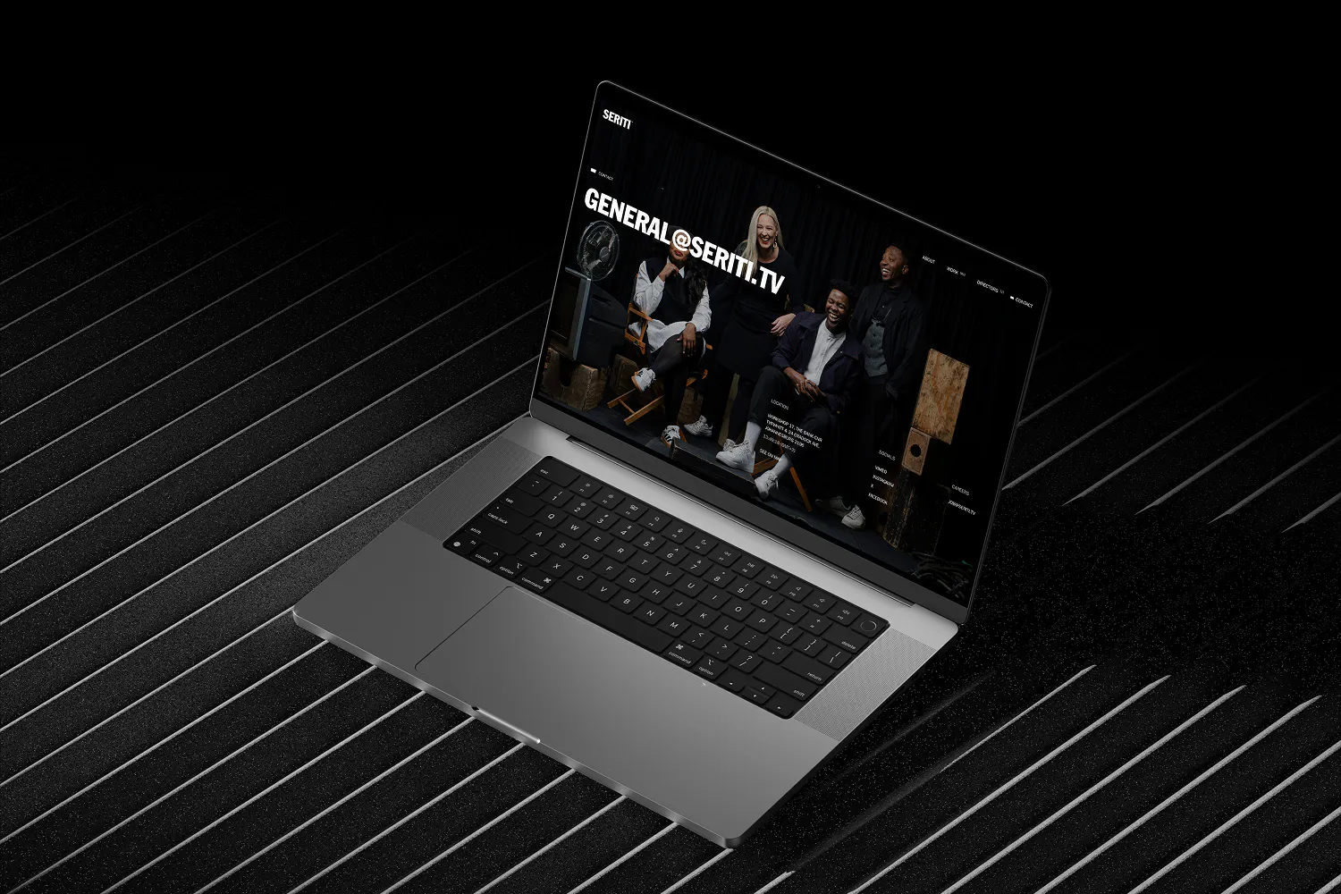
The website was where the tension was sharpest. Cinematic systems tend to collapse when they meet a CMS. Functional systems tend to flatten what made the studio distinctive in the first place. We held both by treating the frame as a layout principle, not a decoration. Every page composes inside it. Hierarchy, navigation and content density built to function first, then dressed.



The Outcome
The new brand launched alongside a new website, giving Seriti a system that holds across every surface it shows up on, from a pitch to a feed to a director's reel. The 16:9 frame anchors the identity and scales with the studio rather than being redrawn every time the work evolves. A studio at Seriti's stage will keep changing. The brand absorbs that without breaking, which is what gives the work the room to keep doing what it does: hold attention without asking for it.