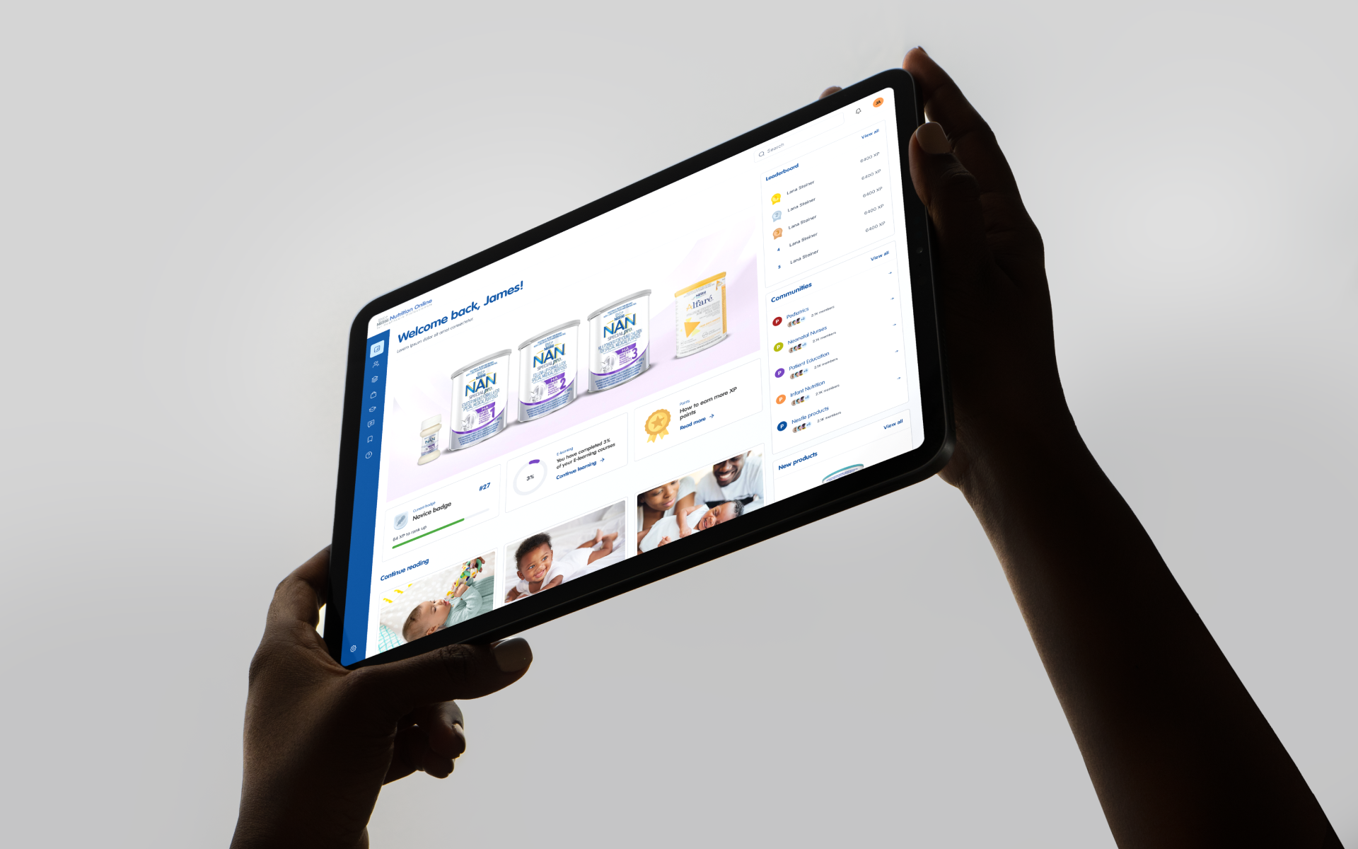
Spotify Africa
Sector
Brand Campaigns
Scope
- Strategy
- UX/UI
- Motion
- Build
Overview
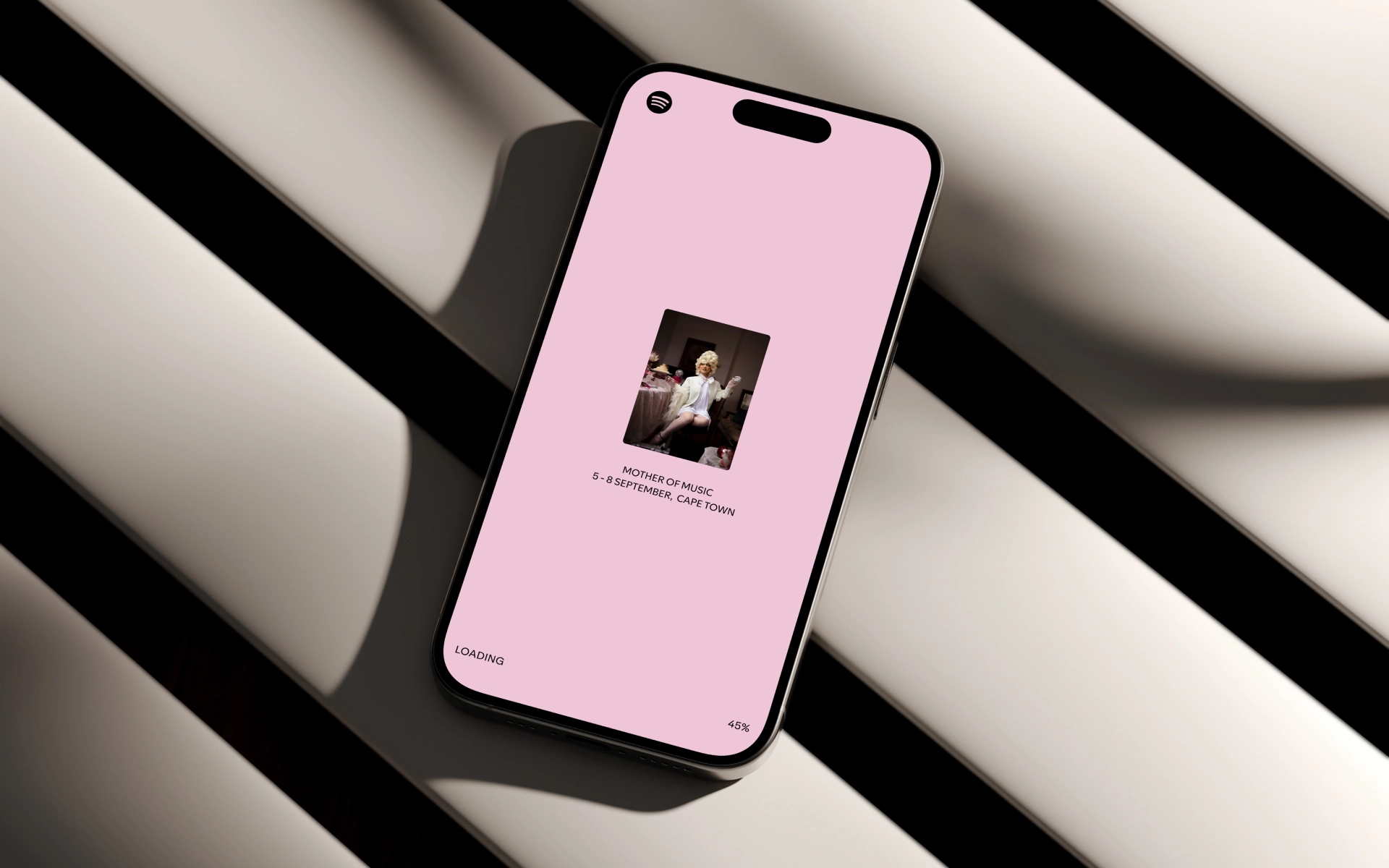
Mother of Music was Spotify Africa's four-day celebration of the continent's musical lineage, hosted in Cape Town and bringing global and local artists onto the same stage. The website had to do the same thing: carry Spotify's brand worldwide while feeling unmistakably of the place it came from.

The problem
Spotify is one of the most recognisable brands in the world, with a design language built to scale across every market it operates in. That consistency is a strength, but it can flatten the specificity of a campaign rooted in a particular place. Mother of Music was not a global product launch. It was a celebration of African music, made in Cape Town, for an audience who would know immediately whether the site spoke their language or borrowed someone else's.
The brief asked for a campaign site. The harder question underneath it was how to make a destination that read as Spotify and as African at the same time, without compromising either.


The approach
We worked as an active partner inside Spotify's global system rather than around it. The components, the type, the colour discipline all stayed recognisable. What we pushed on were the moments where the site could carry something the system on its own could not: the rhythm and the visual culture of the music it was made to celebrate.
Decisions came directly from the source material. The way artists were introduced, the cadence of the motion, the typographic treatment of the lineup all took their cues from local design references rather than the default campaign-site playbook. Every choice went through Spotify's brand team, and the ones that survived were the ones that earned their place.

The work
The site evolved across the campaign rather than launching once and going dormant. In the build-up phase it carried anticipation, introducing the artists and the idea. During the four days of the event it became live infrastructure, updated against a real schedule and built to perform under load.
The custom UI moments are where the site does its best work. Patterns that would normally default to global Spotify components were rebuilt where it mattered, with motion design tuned to the energy of the event rather than the polish of a product page. The result reads as a campaign site that knows exactly which audience it is for, sitting comfortably inside the parent brand without disappearing into it.

The outcome
The site held the campaign. Spotify's global team approved the work that pushed their system, the local audience saw themselves in it, and the experience scaled across the four days without losing the energy that made it worth visiting in the first place.
Working with a brand at Spotify's altitude is less about adding more, and more about knowing what to leave alone. The decisions that mattered here were the small ones: where to follow the system, where to break from it, and how to make either choice feel inevitable.